Find out why there’s an art to Designing Headlines for Maximum Response – Here are five proven facts to help you get the most from your communications
Headlines are used everywhere in copy. You must read more into them than just the words themselves to get the best response possible from your marketing materials. Pass these great tips onto your designer next time you’re doing any direct-response marketing.
FACT: Avoid using punctuation in your headlines (question marks on the other hand are OK).
REASON: A full stop or exclamation mark signals the end of a sentence or to “stop reading any further”. This is the last thing you want to happen. Have a look at headlines in newspapers. None have full stops because they’re designed (as well as written) to get your attention and make you want to read more.
FACT: Never use fancy, elaborate script fonts.
REASON: Your headline might look elegant but it just won’t get read so choose your font carefully. Leave elaborate typography styles to fancy wedding invitations and elaborate champagne bottle labels. Your choice of font might be determined by the overall style you’re looking to portray but don’t let it be to the detriment of legibility that will stop readers reading more and taking action.
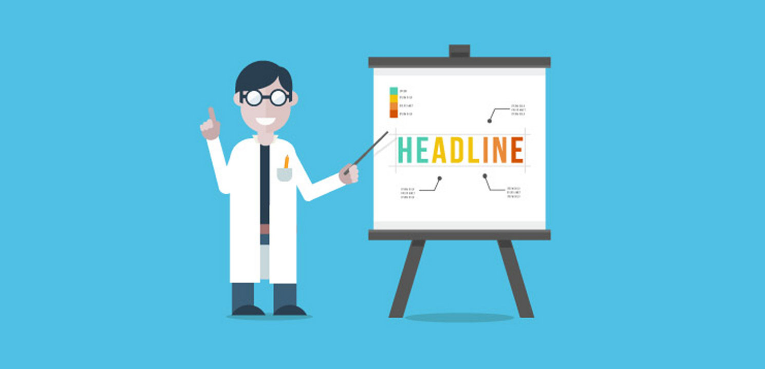
FACT: Headlines work better in darker colours rather than brighter colours.
REASON: You need to strike a balance between impact and legibility. If your headline is too bright it can be overwhelming and distract the reader from reading any further. The colour blue is known to convey trust and reliability. Green is believed to be calming and increase concentration. For maximum legibility your safest bet is to choose a colour with the highest contrast possible to the background it is appearing on. That said, simply using black on white might be too severe and may influence your font choice and its weight.
FACT: Never use ALL-CAPITAL-LETTERS for your headline.
REASON: ALL-CAPS are difficult to read and tiring on the eyes so your reader will simply give up. Upper and lower case is much more legible. Words with ALL-CAPITAL-LETTERS have no shape. When we read text, especially when we read quickly, we do not read each individual letter. Instead we read whole words and phrases by recognising their familiar shapes. Words are more recognisable using letters with “ascenders” (like the letter b) and “descenders” (like the letter p).
FACT: Your headline has the most important job of getting attention and so must be interesting as well as legible.
REASON: If it doesn’t get attention then the rest of your advert or direct mail is a complete waste of effort.
For a FREE design consultation please call us today on 01908 265055.