This is a question often asked of graphic designers when producing corporate sales and marketing material.
I’m sure you’ve had to make a choice of colour yourself many times in your life. What colour is your car? What colour have you painted your living room? What colour is your front door? What are your favoured colours for clothes? What colour do you paint your nails?
These all come down to personal choices and preferences. But how much are we influenced by society in general? Do we choose a colour simply because we like it? Or because we want to be perceived in a certain way and therefore become associated with a colour because of what it symbolises?
When developing your brand identity throughout brochure and leaflet design, advertising media and web design it is important to understand the psychology of colours, their meaning in different contexts and how they influence our psyche.
When it comes to sales and marketing choosing colours is seen to be more of a science particularly when you consider the behaviour of consumers and their decision making processes. In this case your choice of colours used throughout your corporate communications material should be considered much more carefully.
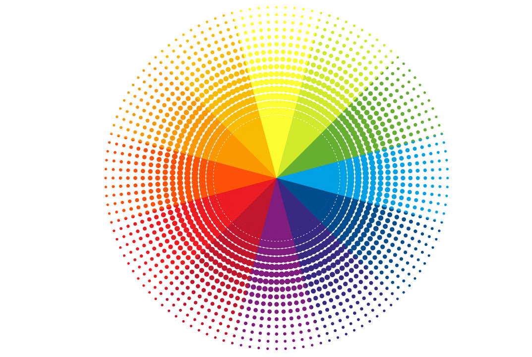
The psychology of colours and what they represent can greatly influence how and where they are implemented. The representations listed below are associated to perceptions in the western world, however, what these colours symbolise can vary greatly in different parts of the world.
Black
This is a colour of authority and power. It’s also a sombre colour, looked upon as being bad, evil or sinister. It can also portray authority, elegance, seduction and mystery. It’s high contrast against white or light backgrounds is ideal for text legibility. Suitable as a background colour if you want to exude drama, luxury and high class, especially when used in combination with a very high gloss finish.
White
Generally associated with purity, neutrality, cleanliness and also youthfulness. You see white emphasised on healthy food products, additive free foods and skin care products. It’s the best background colour for website pages as it will aid legibility and give the highest contrast possible for the darker spectrum of colours added on top of it.
Red
Red represents energy, strength, excitement and passion. It’s the colour for danger and living life on the edge. It’s often associated with movement and speed. Be careful how much of it you use in your marketing material as it can be overbearing or aggressive. However, if used in moderation it will have the most impact and be more striking. It is best used as an accent colour, when combined with neutral colours.
Orange
A very strong colour associated with flamboyancy, feeling energetic, happy and having fun. It’s the complete opposite to calm and serenity. Used a great deal in connection to organic products, energy drinks, adventure holidays, theme parks as well as a number of fast food chains to tell customers they are getting value for money.
Brown
Can signify being reliable, trustworthy, logical, efficient and characterise stability. It often has positive connotations with earthy, natural or organic products and portray a conscientious, hard working ethic. Works well together with yellow and orange tones.
Yellow
A very bright colour which represents alertness, cheerfulness and warmth. Yellow enhances concentration and appeals to intellectuals. It’s a great colour to use for promoting social activities and events due to its feel-good characteristics. Yellow is also associated to optimism as you do on a sunny day! Just like red it can be overpowering if overused.
Green
The colour green has many positive associations. Nature and fertility. Freedom, freshness and tranquility. Good luck, generosity and peace. Healing and well-being. However, green can also have negative connotations such as envy, escalation and excessive wealth. Use lighter tones when you want to achieve a calming effect and darker shades of green when you want to express a bolder character.
Blue
A cool, calming colour which aids clear thinking, confidence and high productivity. Darker blues represent sensitivity of feeling and can convey harmony, peace and tranquility. Blue also symbolises trust, reliability and dependability.
Purple
The colour most identified with royalty and so it is associated with wealth, prosperity and sophistication. Purple can be used to give a feeling of mystery, wisdom and respect. Works really well with silver and gold.
Pink
A comforting, soft colour suggesting femininity, gentleness and well-being which can suggest the feeling of calmness and relaxation. It also symbolises love and romance. Associated with many cosmetic beauty products.